Why Isn't Your Landing Page Converting? 7 Mistakes That Keep Recurring
"We have traffic, we don't have leads." If I got a shekel for every time I've heard that sentence, I wouldn't need to build landing pages - I'd be commissioning them.
The good news: in most cases the problem isn't the audience, isn't the product, and isn't even the campaign. It's the same seven mistakes that recur in almost every landing page that isn't converting. Here they are, along with what to do about each one.
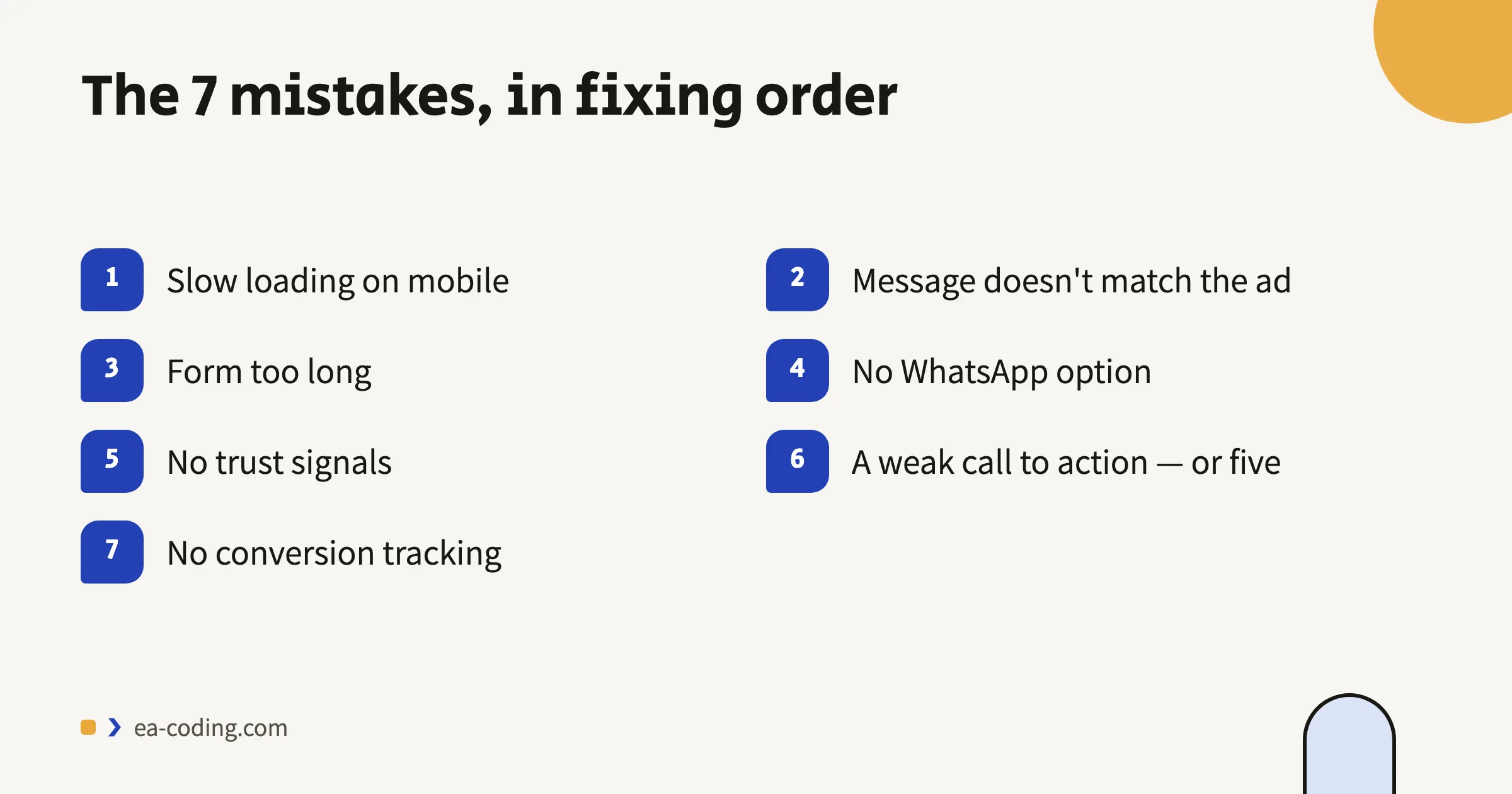
1. The Page Loads Slowly on Mobile
The mistake: a page built and tested on a designer's monitor, with giant images, heavy fonts, and scripts from every measurement tool ever invented.
Why it kills conversion: most of your paid traffic comes from mobile, and someone who just clicked an ad is at peak impatience. Every second of white screen is an invitation to go back to the feed.
The fix: compress images and serve them in modern formats, load only what's visible above the fold, and throw out every script whose data nobody actually looks at. Test on a real phone on a cellular network - not on the office Wi-Fi.
2. The Page's Message Doesn't Match the Ad
The mistake: the ad promises "a free first consultation," and the page opens with "Welcome to Company X, established 2009."
Why it kills conversion: whoever clicked the ad clicked because of a specific promise. If the page doesn't continue that exact sentence, the visitor feels they've landed in the wrong place - and closes the tab.
The fix: the page's main headline should be a direct continuation of the ad, almost word for word. Multiple audiences or promises? Build a page variant for each. Yes, it's more work. Yes, it's worth it.
3. The Form Is Too Long
The mistake: first name, last name, phone, email, company name, job title, estimated budget, and how you heard about us.
Why it kills conversion: every additional field is another reason to abandon. You're not yet at the stage where you've earned the lead's life story - you're at the stage where you need a way to make contact.
The fix: name, phone, done. At most one extra field that genuinely changes the first conversation. Everything else you can ask on the phone - where it also sounds a lot less like an interrogation.
4. No WhatsApp Option
The mistake: a page aimed at an Israeli audience that offers only a form - or worse, only "leave your details and we'll get back to you."
Why it kills conversion: in Israel, WhatsApp isn't a communication channel, it's the default. A large share of visitors simply won't fill out a form, but will happily send a message - it feels personal, immediate, and non-committal.
The fix: a prominent WhatsApp button with a pre-filled opening message ("Hi, I came from the X page and I'd love to hear more"). The form stays for those who prefer it - the two channels live perfectly well side by side.
5. No Trust Signals
The mistake: the page asks the visitor to hand over their phone number but gives no reason to believe there's a real business behind it.
Why it kills conversion: a visitor arriving from an ad doesn't know you. Without social proof, hesitation beats curiosity.
The fix: client logos, one or two genuine testimonials with a name and a face, and one clear positioning statement that says who you are and who you're right for. You don't need a wall of awards - you need one good reason to believe.
A good landing page doesn't convince people to want the product. It removes every reason to hesitate on the way to something they already want.
6. A Weak Call to Action - or Five of Them
The mistake: a grayish "Submit" button, or the exact opposite: "Contact us," "Download the guide," "Follow us," and "Join the newsletter" - all on the same page.
Why it kills conversion: a generic button doesn't tell the visitor what happens after the click, and multiple options scatter attention. A visitor weighing five actions usually picks a sixth: leaving.
The fix: one call to action, phrased as an outcome ("Get a quote within one business day"), repeated down the page in the same wording. Everything else - out. A landing page is not a full business website, and it shouldn't behave like one.
7. No Conversion Tracking - So No Learning
The mistake: the campaign runs, money burns, and nobody knows how many leads came from which ad, because nobody set up conversion events.
Why it kills conversion: without measurement you can't know what works, so you can't improve. The page stays exactly as it was on launch day - including every mistake in this article.
The fix: define a conversion event for every form submission and every WhatsApp click, connect them to your ad platform, and set a recurring review date. A landing page isn't a project that ends - it's a product you keep improving.
And What If You Do Get Leads - but the Wrong Ones?
That's the inverse problem, and it's almost as common: the form fills up, the phone rings, and most enquiries are looking for something else entirely. That's a conversion problem too - it's just disguised as success.
Usually one of three things is to blame:
The page never says who it isn't for. One honest sentence - "suited to businesses already running an active campaign", "not suited to first-budget projects" - filters better than any form field. People appreciate the directness, and it saves them a pointless call too.
The headline promises too broadly. "Digital solutions for business" will bring you enquiries about everything that exists. The more specific the promise, the more focused the enquiries - and the fewer, which is fine.
The single qualifying question is missing. Not a long form - one select field with three options that separates the types of enquiry. It deters nobody serious, and it saves you the call where it emerges after ten minutes that there's no fit.
A simple metric worth using: don't count leads, count conversations that led to a quote. A page producing ten leads of which two are relevant beats a page producing forty of which one is.
It's Not Just Form Length - It's How the Fields Behave on Mobile
Mistake 3 above is about how many fields there are. But a four-field form can feel like ten, simply because nobody tested it on an actual phone. These are the ones most worth checking:
The field type isn't set. A phone field that opens a letter keyboard, an email field with no @ within reach. That's one line of code (type="tel", type="email"), and the difference in feel is enormous - suddenly the keyboard that opens is the right one.
No autocomplete. The browser can fill name, phone and email in one tap - but only if the fields are marked correctly (autocomplete="name", "tel", "email"). Without it you've forced the visitor to type by hand what could have filled itself in a second.
Labels that vanish. A placeholder used as a label disappears the moment typing starts, and then you can't verify what you entered before sending. A conversion problem and an accessibility problem in the same line.
Errors that only appear after submitting. You filled seven fields, hit send, and scrolled back up hunting for what's wrong. Validate as they go, and say what to fix - not "invalid form".
A button that's too small, or too close to the field. A finger isn't a mouse. Generous tap target, and enough spacing to prevent mis-taps.
Zoom jumping on focus. If the text size in the field is under 16 pixels, iOS zooms in when it's tapped and the page lurches. A correct size solves it.
The simple test: fill in the form from a phone, on mobile data, one-handed, while walking. Anything that annoys you there annoys a visitor too - except they aren't the business owner, so they just close it.
And If the Problem Is Bigger Than One Page?
Sometimes you go through all seven, the page is clean - and leads still don't come. Then it's worth lifting your eyes from the page to the whole system: maybe the traffic never arrives, maybe the main site burns the trust the ad built, maybe the problem is somewhere else entirely. That's exactly why I wrote the "got a website but no customers" diagnosis guide - it walks the whole pipe, from Google visibility to the form, in one hour.
And one update specific to forms: since Amendment 13 to the Privacy Protection Law came into force, a form that collects details must include a disclosure notice - what is collected, what for, and where it goes. Beyond the obligation, it helps conversion: transparency next to the submit button calms exactly that last-moment hesitation. What exactly to write - in the Amendment 13 guide.
Bottom Line
None of these mistakes requires a miracle, a huge budget, or a ground-up redesign. They require someone who reads the page through the visitor's eyes, not the business owner's. That's how I approach every project on my landing pages service - conversion first, decoration second.
Got a page that gets traffic but doesn't produce leads? Send it to me - and I'll tell you which of the seven are running on it right now.
More from the blog
Is an Accessibility Plugin Enough to Comply With Israeli Law?
A floating accessibility widget doesn't make a site comply with IS 5568. What the widget really does, where it fails, why it sometimes hurts, and what does cover you.
7 min readHow to Write a Website Accessibility Statement in Israel (With a Template)
The accessibility statement under Regulation 35: what the regulations require in it, where to put it, what never to write, and a template you can adapt to your site.
7 min readHow Do You Back Up a Website Properly? What, Where, and How Often
A backup that actually saves you: what must be in it (not just files), where never to store it, how often by site type - and how to know it works at all.
6 min read
Reaching me is the easy part.
A few lines in the form if you prefer writing - or straight to the channel you already use. Either way, it's me answering.